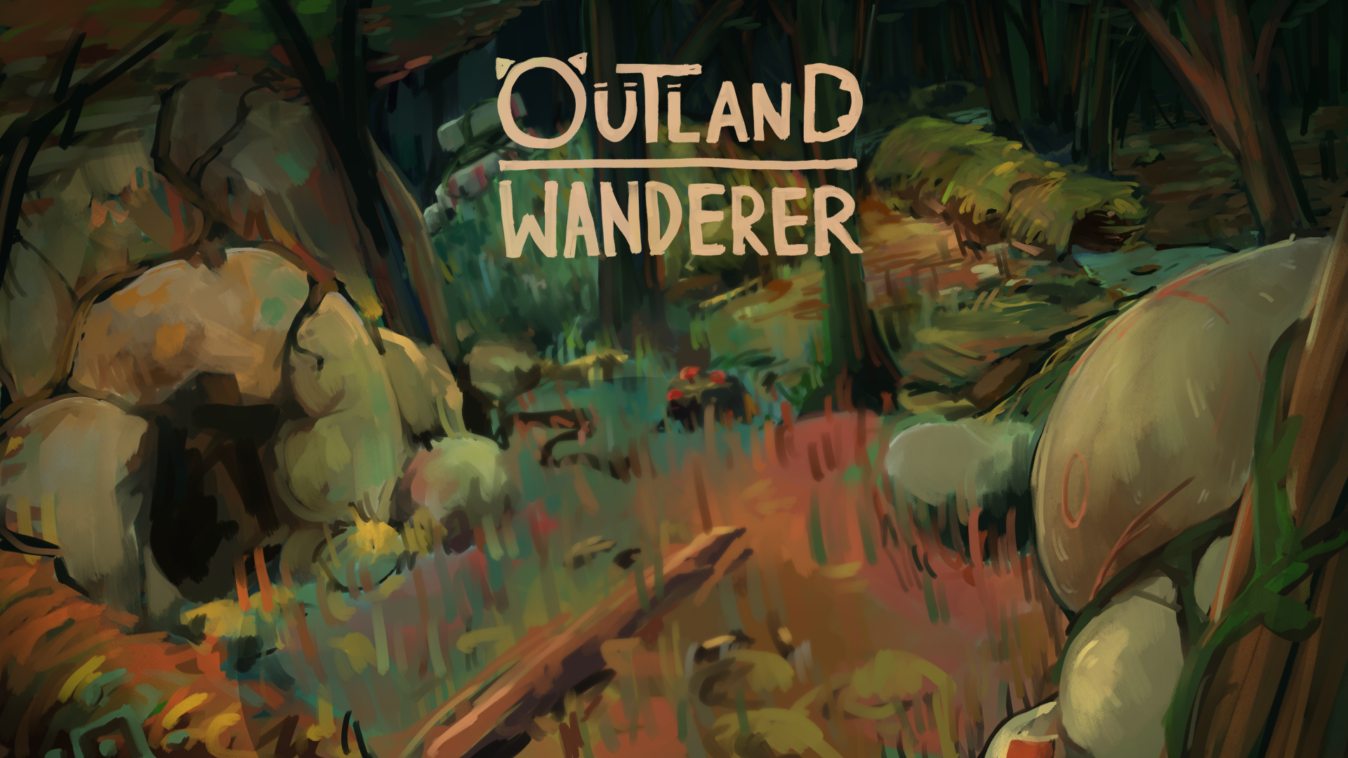
Outland Wanderer
Devlog: Aesthetic of Playable Character and Redesign Update 1
Hey there. It's been about half a year since I started developing Outland Wanderer, and I've decided to make a rather big change to the project -- redesigning the main character. In this devlog, we'll be referring to him as Tenki for ease of understanding. To be honest with everyone, I was not satisfied with his design. I'm very happy with him as a character, but was not content with his visuals. Many fans appeared to share these sentiments as well. Earlier on, Tenki received a small redesign; I thought I could change some details, tweak it here and there, and have it turn out fine. Last time, I redrew his inventory screen sprite, which meant a lot of clothes needed to be redrawn as well. As you can tell by the existence of this post, that redesign didn't really work for me. I thought it might be good to make him a cutesy little adventurer, in order to stand out from the cast. Unfortunately, I made him stand out a bit too much -- he felt too out of place. While Tenki is supposed to seem out of place narratively, the visual appeal was definitely lacking.

The idea of redesigning Tenki came as early as v0.0.1. I was dissatisfied from the very start of the game. His anatomy was not... right. The idea of a furry dragon concept did not get executed well. As much as this game is meant to cater to both top and bottom tastes, bottoming was disproportionately favored. This was because bottoming scenarios were far easier to come up with for Tenki -- he's a newcomer in this world, someone that needs to be shown the ropes. His design should convey that sentiment, but to a more limited extent than previously.
Tenki was originally meant to be a character with little personality, to allow people to insert themselves into the story. The design reflected that, as he looked bland, and without any particular direction as a character. Tenki's current design went far overboard -- his colour scheme, de-centered mouth, and non-existent nose/snout/nostrils, all made you feel like something was missing; it made him feel out of place. It was alright to have as a placeholder, but I don't want the main character, the face and outline of Outland Wanderer to feel... incomplete. While I don't want to prevent people from inserting themselves into the story, I decided that Tenki should have more character of his own -- which is reflected in some of the newer content released for the game. His appearance will need to follow suit, so as to keep visual and written design consistent.
Over the course of approximately 11 updates, I didn't fully commit myself to redesigning him. This was largely due to one of the classics, sunk cost fallacy. I didn't want to waste the time I spent drawing him; there rae over 20 CG Scenes with him, and it's all going to be wasted in some way. At least, that's how it feels, as the person that made that art. It's also a bit scary to make a change like this. Suddenly changing the face of the game most of you have been playing for a while, right in the middle of its development... it's fairly uncommon. While I understand that you may be a bit distraught if you really liked his design, his cuteness in particular, a change like like this feels necessary at this point. I hope that after a while, it'll turn out to be a good decision in your eyes as well. To help explain what I mean, after a while of drawing Version 0.2's MC, I realized that his emotional range was incredibly limited. The off center mouth made it nearly impossible to draw emotions properly -- they simply didn't look right. I've improved a lot as an artist since I started making this game, particularly when it comes to drawing furries. I think all of that new experience will let me improve upon Tenki's design, and give myself a better base template to work off of. My hope is that this will make many more things possible -- topping being easier to write for Tenki, different narratives showing a wider breadth of emotion... it should make the game that much more vibrant and varied. I want my project to grow to include all of that and more; I don't want to be hindered by a mistake I made a long time ago.
This will be a one-time thing. I think it's a bad idea to do that, and I really don't want to go back and redraw things again. I need to make him look right this time. So, to try and give the audience a voice in that, here are some designs that should cover several new aesthetics, without changing too much of his core design. There are 3 main designs that I'm looking at -- Please note that these are only rough drafts and I'll have another devlog along the development.

Some fans have brought up concerns regarding Tenki losing his more "draconic" traits. I want to make it clear that Tenki will continue to be a dragon. All of his new designs give him a snout, which may or may not align with some people's conceptions of dragon character design. While that may deviate from the norm, other dragonlike aspects will be featured more prominently -- I want it to be clear that Tenki is a dragon, even going by design alone. As part of that, I'll be changing his colour scheme. Tenki's fur colour is actually blue; the gray color is the result of an orange overlay being applied to that base shade. I'm not very satisfied with that. I want him to be more colourful, rather than drab.
Being completely honest, this is a result of me not planning enough when I first started the game. I designed Tenki from scratch in a matter of a few hours, and I never looked back. Now that I'm looking back from the future, though... I can easily say I regret that. Learning from that, I'll be giving much more thought to his design. I can't say if there's anything I would or wouldn't change with absolute certainty right now. As it stands, my current priorities are that the MC be appealing, that his theming be consistent with his character, and that people may still self-insert.
The redesign will not be putting the project on pause -- no new CGs will be produced until one is decided upon, but new content will be written. CGs for those writings will be implemented as soon as I can, following a new design being chosen.
Comments
Log in with itch.io to leave a comment.
Design 3 looks pretty on point probably just my love of beards talking but it also let's him stand out in the sea of smooth (for as smooth as a furry character can be :P) MC's imo.
Either way 2 and 3 def are a step in the right direction the current design always just looked a bit to goofy and flat imo hopefully whatever redesign you choose in the end your happy with can't wait to see.
V2, I prefer V3, but he looks a lot more experienced and mature, which he isn't.
Actually, I see the comment on Patreon that says it will make the main character less like a dragon, but whatever. Whatever furry or dragon they are both not real or the normal way they are shown in the furry games or just in gams added some factors or secondary creation. I mean it is bad that the dragon is drawn like something not fit the basic form, but in my opinion, it is ok to add some factors to make it a little different, and don't even mention that it is in a game, in another world, the dragon in that world is just so different is so reasonable xd.
I prefer v1 or v2
V1 looks better 🥰😊
I love when devs become very open about this stuff. A very delicate task to have for balance.
1 feels like the best fit for a self-insert character, looking fairly clean and simple.
I personally prefer 2 overall. It's main advantage over 3 for me is that 2 gives a vibe of being able to both top or bottom very well. 3 feels like a veteran adventurer who can command (and mostly top) that already knows his sense of purpose. He's very handsome and has natural appeal, which is fine as an archetype, but for the purposes of this devlog, I'd take 2.
2 feels like an adventurer done right, that can be honed in many ways. Can also open up for more convenient design changes, as 3 got more pronounced features already.
I love this devlog. No matter what you settle for, do know that we've been enjoying the work nicely! It can only get better from here~ thanks for the opportunity
It looks like most people favor the third one, but i feel like it makes him look way older and more mature, like a veteran, when hes supposed to feel like a newcomer whose very inexperienced. However, the 2nd one still feels young and a little innocent, while still having a lot more of the energy of a verse/top.
Honestly, the current design of the MC doesn't scream dragon and more like a goat. It makes it more off when you came upon the dialogue that introduces him as a dragon. I still like the current design but you can tweak it a little bit more to make it more dragon like. There's also the part in the current design where it looks like he doesn't have a snout and for some reason for me it looks weird. I think the game is still on the phase where a lot of changes can occur but I'm looking forward for the changes that would make this already good vn to an awesome one.
Thank you so much! Yeah for the current design, it looks more like a furry without a snout. Which, can be weird on its own. I really want to execute the dragon theme well, so it's gonna take some time! But I'll say it's gonna be worth it :p
IMO: 1's horns + 2's eyebrows + 3's everything else.
Just my artists eye.
I think that'll be a nice design as well, maybe with added scales to the jaw beard, or a horn at the end of the snoot?
My honest opinion. At first I thought we'll be definitely playing as a goat, until I get to the game where he is a Dragon, although despite that, the current design never made me feel like he is a Dragon. Though still cute, but indeed I agree that it was a little off.
Design one seems to not change much and stayed cute.
Two still cute, but with more detail.
Third however is completely somehow different on my perspective. Like his much older than what it seems on the game. And I like that, a bit maturity to fit his environment. Because the current one seems like, a face of a submissive bottom, apologies if that seems like I'm stereotyping. The characteristics of the norm is engraved to me
Haha I see I see! True True. I started the game thinking he's gonna be a big bottom. Well, but now that I think it's much better for everyone to enjoy the game, and think that he's more of a vers/switch. The goat and dragon thing, I didn't convey it enough with the simplistic features but hopefully I can really put my effort into designing something that looks pretty great :3
Number 2 & 3 look amazing!!
Overall I think that the design 3 best looks like a dragon, perked up ears and a pronounced beard look like extra sets of scales and horns and make Tenki look kinda like dragons are always portrayed with numerous scaly horns stretching out behind the head, though when we talk about the "horns-horns" I like the ones on the design 1, thin at the base and thick after the middle horns look a bit weird to me, the lush hairtuft hides the horns as well but I think thats not really relevant.
Ahh! Damn that's pretty reasonable. I feel like dragons are always soooo complex, has a lot of facial features that makes them look cool and stuff. I'm steering towards that dragon design, despite of the snout. And I really hope that it's gonna satisfying to see him in the CGs :3
Yeah Yeah! I can feel that top/vers energy in the third one, which is why I included this design, he looks pretty cool. Though, for what it's worth. The dialogues been portraying him as a very cute dude and ehehe it's gonna take some magical being to convince that he's cuter than cool. But overall, I'm really happy to see that people like a more masculine/vers dude (well I think... the game itself is pretty masculine.
You're right though, Eywind is pretty nice as a main character. I don't very wish to compare each other but it really shows what I lack in terms of character design. I will try harder though, it's been half a year since MC's design and it's only uphill from here.
for what its worth I always thought the original simplified look was cute in its own way but I do like these new designs more. I like design 1 the most here :D
Yeah Yeah! I think a lot of dudes like the cute one, I myself liked it too. But it's also more fun to see a hot one and I really hope I can bring that out :p
Tbh honest, i never liked the MC's face yeah. The body is great tho. I kinda prefered the previous designs, like red dragon MC and other characters.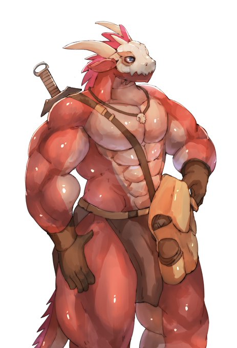
yeah the thing is I don't draw this style much anymore. But I think the newer design will be closer to this one, except for the mask.
Oh im so sorry, thought nudity was fine here cuz some game covers on this site have nudity in them my apologies. I removed the sebas pic.
I like both your styles, just prefer older one for some characters because they're more detailed and have glistening muscles :3
I don't want a complete overhaul, but I think the biggest change would be adding a snout :3
I see I see, the designs are more of a general vibe than specific features. I'll say 1 screams more bottomy with the current design while design 3 seems more vers/dom. And design 2 stands in between :p